KONATUS
Redesign of a banking business application
Role: Consultant UX Designer
Client: Credit Mutuel Arkéa
Team: 1 UX Designer
Context: Consulting mission for OAIO, digital agency

Overview
The objective was to redesign one of Arkéa's digital applications. We completely redesigned the app, from the wireframes structure to the visual identity, in order to get a more functional, intuitive and visually appealing application.
The existing app
Konatus is a wep-app designed to manage the creation of digital products. Its objective is to optimize project management and improve the workflows of the digital team (product owners, team managers etc.).
In order to improve the application, we start by recapitulating user feedbacks.
USER’S FEEDBACKS
Users think that the application isn’t very intuitive: it’s visually too monotonous and not very clear
Users often feel overwhelmed: the information is not hierarchical and it lacks of graphics
Users can’t have an easy access to their personal folders and notifications: an easily and quickly accessible user menu is missing.

A new visual identity
Based on the feedback from users, we decided to change the look and feel of the application, looking for a more dynamic, intuitive and appealing visual design.

Secondary colors
We also took into account the colors associated with the world of project management (those used in graphs and dashboards). Basic colors brings clarity and simplicity to data analysis. We decided to use these colors as secondary colors, to illustrate values and indicators.

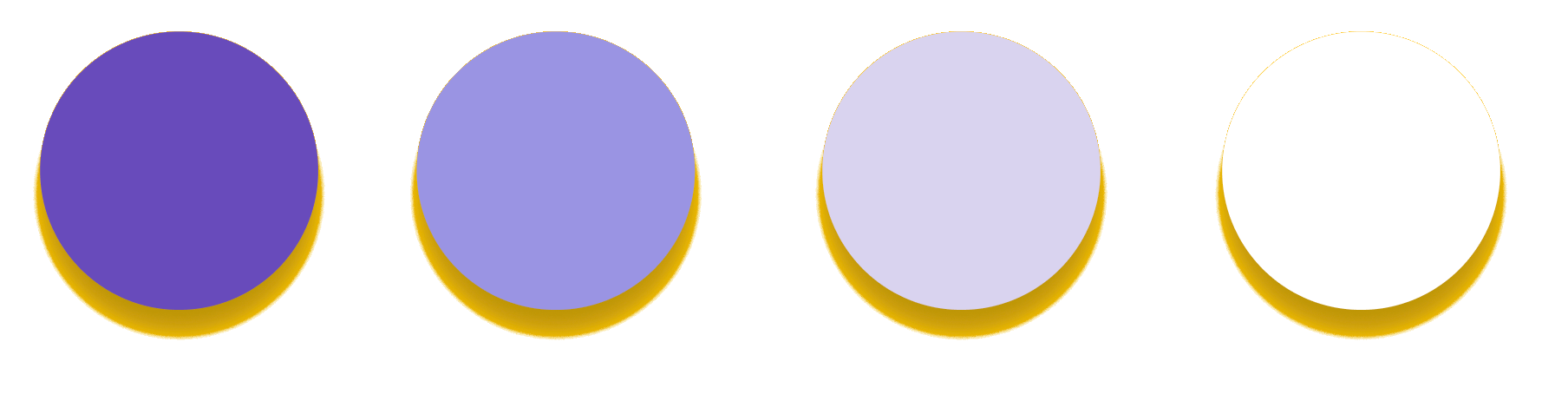
Primary colors
Since we are designing an application for the bank, we were inspired by the colors used in the business world. Purple is associated with finance and power. We chose purple and its variants as the app's identity and primary color.

Structure & consistency
Wireframing
In order to have a more uniform and intuitive app, we set a single structure for all the screens of the app,
We add the user menu and make it visible throughout the application, to give the user the opportunity to access his personal space at any time.

Design System: Atomic design
To build our design system, our approach is that of atomic design. We defined basic components (atoms) which, when grouped together, formed other more complex components (molecules and organisms) to create more consistent and functional screens.

Proto Design System
The final product
We have here below the definitive hi-fi prototypes. We can see the following improvements with respect to the old application:
A new look and feel, more appealing and pleasant.
A more intuitive and dynamic interface, without losing consistence.
The use of graphic elements that facilitate the management of data and projects: graphs, cards, visual plannings...
A permanent access to the user menu that allows to customize the interface according to the person who is using the application.

A new and customized way of displaying the project list
(By using filters to display select projects)
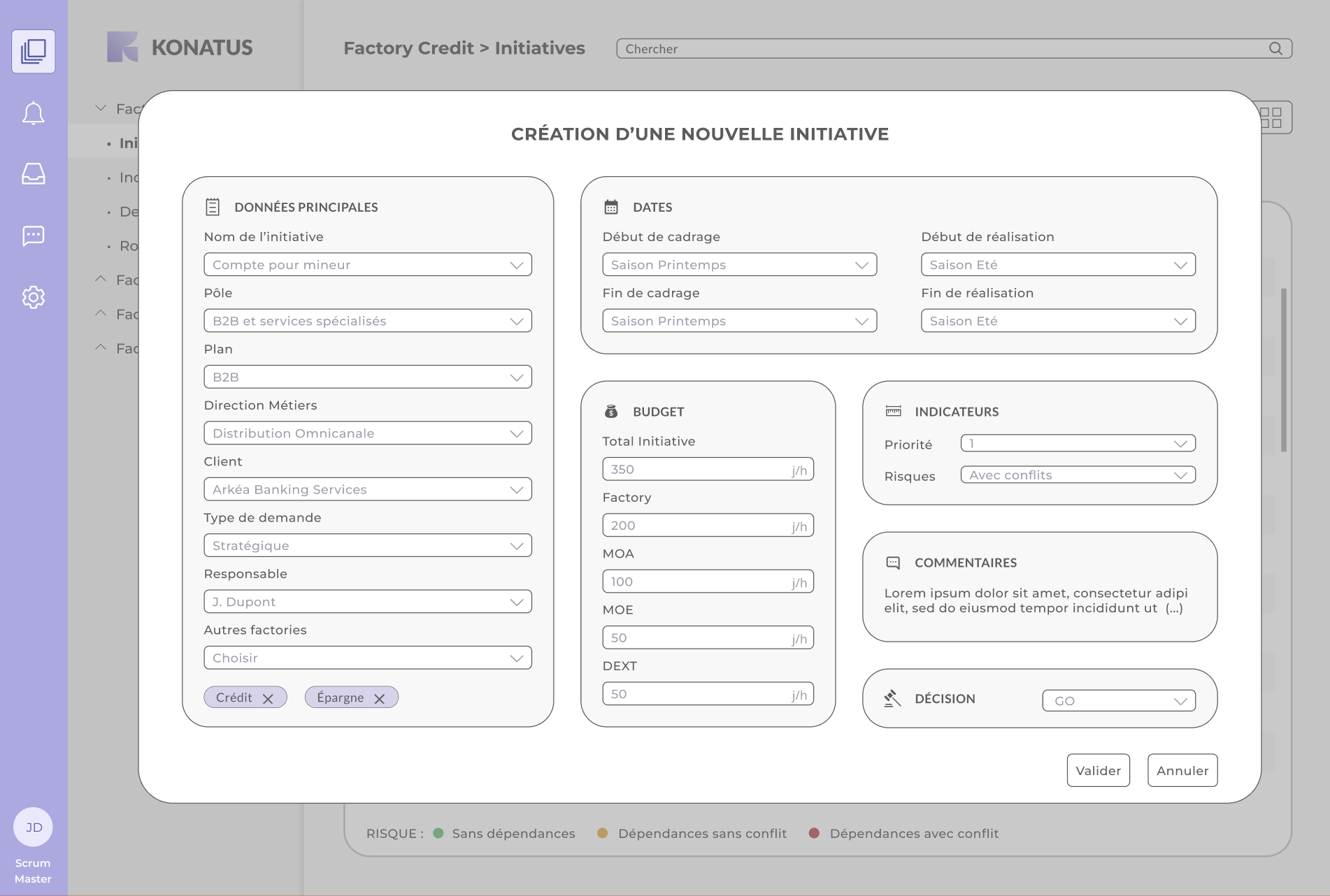
A more dynamic and simple way of creating projects
(By entering all data on a single screen)

A more efficient way to visualize the roadmap
(Immediate view of conflicts)

A detailed roadmap
(View of project details without leaving the roadmap)

A more direct and visual way of representing indicators
(Visual data analysis)
Thanks for reading!